
UNIFORM
RULES & STANDARDS
BACKGROUND
It has been noted from the 1996
Club Team photo that everyone on the Central Park Track
Club seems to have his/her own uniform, which contradicts the
definition of a uniform. How did this state of affairs come about?
The explanation is simple enough. At some point in time, a batch
of uniforms was ordered based upon a specified design. In time,
the inventory was depleted. But the style, the manufacturer and/or
the retailer have gone out of existence by then. Therefore, a new
uniform had to be designed and ordered. The process repeats itself.
This is the sort of mundane problem that is faced by any similar
organization.
As a non-card-carrying, practicing sociologist, I
am interested in seeing how an organization attempts to solve such
problems, as this tells us a lot about the organization itself.
Democracy and group decision-making does not work in this instance.
This is not say that the club members are apathetic. Nothing
could be further from the truth! Ask any team member about uniforms
and he/she will have plenty of ideas about what is desirable --
and not -- in a uniform. The problem is that these armchair quarterbacks
are not willing to do the hard work of researching orange possibilities,
coming up with and exchanging design ideas, getting samples, comparing
prices, collecting orders, delivering products, warehousing uniforms.
. . At the other extreme, dictatorship by executive fiat
does not seem like a good idea, as it breeds discontent. Therefore,
we have the Uniform Committee, an appointed/elected/voluntary group
of naïve do-gooders who are willing to tackle this thankless task,
with all sorts of comings and goings over time.
As a card-carrying member of the Institute
for Operations Research and the Management Sciences, I think
that the history of the uniform illustrates the importance of product-testing.
Do the shoe manufacturers introduce new technology (air pockets,
pumps, neon lights, etc) without field testing? Does Microsoft release
software without alpha- and beta-testing? Since extensive pre-testing
in the field is out of the question in this instance, we find that
many design and performance problems surface later. What our designers
thought were innocuous decisions may turn out to have significant
impact.
CORPORATE SPONSORSHIP?
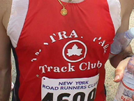
In October 1998, the Central Park Track Club ordered new singlets
from Pearl Izumi. Here are the front
and back views of the new uniform.
Note that the very enterprising Raphael Devalle, who is the
model for these pictures, has gone ahead and found his own personal
sponsors. As you can see, he has sold the front lawn space
to PRO-HYDRATOR and the backyard to POWERBAR.
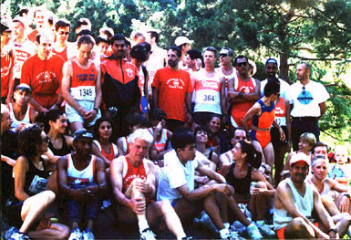
A PHOTO-ANALYSIS
OF RECENT CLUB UNIFORMS
Here is a gallery of
seven photographs of people in different Central Park Track Club
uniforms. We will restrict our attention only to the singlets, ignoring
the club t-shirts and the track suits. We will discuss and critique
each of these singlets (and the people, too).

(l-r) (1) Marty Stanton, (2) Hank Berkowitz,
(3) Rachel Latessa, (4) Karel Matousek
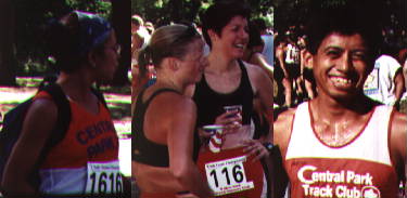
(l-r) (5) Sarah Gross, (6) Julie Denney &
Stacy Creamer, (7) Jud Santos
(1) Marty Stanton is wearing a late-1980s classical
edition of the team uniform:- orange top panel, white bottom panel,
blue letters and logo lined with white lines on the edge, in soft
harmony. Today, this classical uniform confers seniority upon the
wearer, but seldom respect. This is because the uniforms of the
serious runners from those glorious years would have been in tatters
by now, and so only the slackers would still have some left. This
fits Marty's current status as an over-the-hill runner. Maybe the
years of wanton debauchery and drunken revelry has caught up with
him. Having a wife and a son certainly did not help. Ah, but we
digress ...
(2) Now here is a true beauty! Hank Berkowitz
is wearing a singlet from the Liz Maurice collection:- the
white Bill Rogers (with the small black letters BR on the left chest)
brand singlet, with orange letters and leaf logo. As this was offered
in a limited edition on a one-time-only basis, the wearer of this
singlet has the distinction of being a witness at a historical (and
tumultuous) moment in club history.
There exists a flashier version of this rogue singlet:-
a bright neon orange Bill Rogers (BR) brand singlet, with black
letters and leaf logo. Very few people own one. I am the only person
who has one that I know of. I am sure that others have it, but they
might be too embarrassed to wear it. Colorwise, this is the most
orange of all the uniforms that ever were. Unfortunately, the orange
dye material comes off very easily. So if you run a long race in
the middle of summer, you will probably end up with orange skin
when you finish. What greater demonstration of team loyalty can
there be!? Now go home and try scrubbing it off your body!
By the way, this collector's series also includes
a green warm-up track suit with white letters and logo. There is
not a single trace of orange color whatsoever! I love wearing that
because it annoys the hell out of the folks on the Executive Committee!
(3) Rachel Latessa is wearing another revolutionary
design introduced in 1996:- deep orange singlet, blue/white stripes
down the sides, small white letters and logo. The matching shorts
are also deep orange with blue and white stripes down the sides.
Visually, the prominence of the dark orange color makes it very
easy to locate your teammates in a race. In this aspect, this design
is a winner, especially since our other uniforms are based upon
white or black as the primary colors and do not stand out as much
in a crowd.
However, practical experience has shown that the letters
on the singlet fall off too easily after washing. According to the
self-proclaimed product experts, it is possible to keep the letters
on longer by gently ironing them back into place. But an overzealous
Jackie Cortes once hit the singlet with too hot an iron and
the nylon melted away to nothing!
In a way, the number of letters left on your singlet
is a measure of your contribution to the club. Thus, Peter Allen
wears a singlet with no letters left at all, which means that one
can no longer tell that he is with the Central Park Track Club.
Alan Ruben's singlet has just a few letters left dangling
precariously, and it makes you feel sorry for them. The mint condition
of Rachel Latessa's singlet in this photograph would mark
her as a rookie and/or loafer; but it may also say something about
her laundry habits ... ah, again, we digress ...
Ramon Bermo's tattered letters
(4) Karel Matousek is wearing a revolutionary
design introduced in the early 1990s:- white singlet, orange stripes
down both sides, orange rectangle on chest with white leaf and blue
letters inside. The overall look was groundbreaking because it looked
distinctly different from any off-the-rack products.
But there were some practical problems. First of all,
the letters were placed in a location where most people would pin
their race bibs, thus obscuring the club name. Then, on the back
of this singlet, there is the circled maple leaf symbol in orange
of the New York City Department of Parks. I suppose that the idea
was to put something eye-catching in what is usually blank space.
Unfortunately, this has been the cause of some confusion. I remember
running a 10 miler in Central Park once. Midway through the race,
another runner caught up to me and said, "Hi. I am from Vancouver.
Are you from Canada too?" He had taken the leaf logo on the
back of my single for the Canadian maple leaf. I gave a gruff "NO!"
as an answer. I did not mean to be rude, but the middle of a race
was just not the moment to defend the philosophy behind the art
design.
(5) Sarah Gross is wearing the retro version
of the classical singlet (see Marty Stanton in photo (1) above):-
orange top panel, white bottom panel and blue letters and logo.
While the return to nostalgia is admirable, this one is a poor imitation.
When you compare the two, it is clear that the classical is one
is much softer and more harmonized, whereas the new one is brighter
and louder. Thumbs down! We demand the authentic look! Oh, by the
way, Sarah's signature headwear and backpack are not part of the
club uniform.
(6) Julie Denney and Stacy Creamer are
wearing deep navy blue jog bras with the club acronym (CPTC) appearing
in orange color in front. The genesis of the jog bras reflects the
ingenuity of our women. In 1996, the Central Park Track Club women's team won the prestigious
Advil Mini Marathon, doing much for team pride and the women's
standings in the club competition. However, of the 5 scoring women,
Stacy Creamer was the only one sporting official garb. She
had foolishly donned the official singlet and lost about 15 pounds
in water weight as a result. She was very sorry that, though the
team won such a high profile race, the casual or even intent observer
might not have noticed, given the incognito clothing.
So the very enterprising Stacy decided
unilaterally to collect as many jog bras as she could from her teammates
and get them monogrammed with the letters CPTC in bright orange.
This effort resulted in a limited edition of 18 jog bras. Unfortunately,
the color is sometimes difficult to pick out in a crowd and the
small letters are hard to see when one is speeding along. Yet these
people still want their share of team cheering and photo ops!
(7) Jud Santos is wearing the generic no-frills
uniform:- the white Sub-4 brand singlet, orange middle panel with
white club name and logo, orange edges. This unexciting look is
precisely what motivates people to seek new and better things. But
every failed experiment leads people right back to this basic tried-and-true
model. While several batches have been produced over the years,
they are not identical. For example, in one batch, the orange color
is slightly lighter and fades to a pinkish hue after repeated washings
(see Diane Lebowitz).
You have to be very astute to distinguish among the different releases.
The discontent with this version has led to some destructive behavior.
People as different (in shape, speed, ethnicity, personality, etc)
as Casey Yamazaki and Nathan Klejman have been seen
in the bare mid-riff look achieved by applying a pair of scissors.
(Addendum (8/24/97)) An astute reader pointed out
that Nathan Klejman has also cut slits on his singlet right
under the armpits for ventilation purposes. Wow! We are impressed
that someone has been monitoring Nathan closely.)
(8) In July 1997, the Central Park Track Club
sent a team of runners to the World Veteran Athletic Championship
in Durban, South Africa. A special team uniform ("speedsuit")
was designed for this occasion, as shown in the photograph of Sylvie
Kimché. By the way, that trophy in her hand is not part of the
uniform; it was for winning the Fifth Avenue Mile (Master Women
50+ Division).
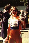
Warning label (courtesy of Keith Royster, racing
after two weeks of gorging on Swiss chocolate, French pastry, Italian
pasta and German wine while vacationing in Europe ): "Never
wear the CPTC speed suit over a protruding midsection"
(9) (8/24/97) Another astute reader (who really needs
to get a life!) pointed that there is yet another uniform as worn
by Mary Rosado in the 1996
CPTC Team Photo. An enlarged view of Mary from that photo
is shown here.
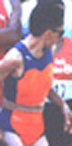
This is a skin-clinging orange/navy blue uniform for
the track runners, and Mary may be the only one who wears it. Indeed,
the notion of a unique one-of-a-kind uniform does seem to be a self-contradiction.
(10) (8/25/97) Oh, we almost forgot about the generic
bare-chest topless look, being most often associated with Jeff
Johnson --- rain or shine, snow and sleet.
(Acknowledgement: Stacy Creamer
provided valuable insights into many aspects of this essay, including
the workings of the Inner Sanctum, the tip on how to iron the letters
back in place, as well as the history of the jog bra, which was
completely alien to the male webmeister. In fact, he had thought
that they were black-colored because he had never been allowed to
inspect one up close ... )
(© Copyright Notice: The above article
is the sole property of the World Wide Web. As such, it can be cited,
quoted and/or otherwise misused at will.)
Excerpt from the Initial Presidential Message
from Sylvie Kimché
(in the 1996 year-end issue of the Central Park Track Club Newsletter)
... I relish the challenge to be your leader and build consensus
on the important decisions. (Except for the UNIFORM THING! I NEVER
EXPECT TO FIND CONSENSUS ON THE UNIFORM ISSUE).
It's Not Easy
Being ... Orange
The common theme to all of the uniforms above is the orange color.
Why orange? The following quotations were collected by Irene
Jackson Schon in the memento on the occasion of the 20th anniversary
of the Central Park Track Club in 1993.
- "With the early --- and growing --- success of CPTC racers,
uniforms became important. At its genesis, club colors were yellow
and black, then white decorated with the green maple leaf symbol.
After several metamorphoses, orange, in various shades over the
years, eventually became the official club color, although not
everybody was entirely pleased." --- Irene Jackson Schon.
- "I hate the orange. I've always hated the orange. I don't
know who started the orange, and I can't stand it and I've never
liked it. I loathe it." --- Frank Handelman.
- "Oh my God, the orange uniforms ..." --- Fritz
Mueller
- "They clash with my red hair, I'll be honest with you."
--- Ann-Marie Resnick.
- "Orange is good if you are from Florida" --- Herb
Schon
- "Orange is the one fashion color that hasn't come around
since my infancy, and maybe before. Is there a reason for that
perhaps?" --- Peter Gambaccini.
- "Orange ... I like orange." --- Dave Blackstone.
- "We used to have white uniforms with a green maple leaf
in it; really hokey old-fashioned looking ... my best races I
ran in those I think." --- Fritz Mueller.
- "The orange uniforms are traditional, whether I like them
or not." --- Marty Smith.
- "We all just look so good in orange; it brings out such
fine skin tone." --- Betty Marolla.
- "Orange is not only appealing, sartorially speaking, but
I think it's very safe at night." --- Hank Berkowitz.
- "The orange uniforms stand out, and I think there have
been good orange uniforms and bad orange uniforms. But in the
words of Bill Clinton, I think we could do better." --- Kenn
Lowy.
- "Orange seems to be a nice, immediately identifying kind
of color, so I always kind of liked it, although I know there's
a whole range or arguments pro and con." --- Tomi Gomory.
- "The orange has become just about as important to some
of us as the red, white and blue." --- Ed Coplon.
- "Fritz is a man of few words --- at least few that I can
understand, so I've never really heard him voice his displeasure
with the orange uniforms." --- Jack Brennan.
- "That was an ongoing battle during my first four years
as president --- Fritz was the most outspoken person against orange
uniforms, and always wanted blue. I'm a conservative person by
nature; Fritz I always considered the other end of the spectrum.
He's further left than I am, in politics and everything, and I
was always taken aback that Fritz wanted a blue uniform like everybody
else, and I was the one that said orange. It was an ongoing battle.
I don't think I was out of office for six months and the next
thing I know we have orange and blue shirts. He was relentless."
--- Norman Goluskin.
- "Well, at least orange is better than blue." --- Harry
Nasse.
- "Uniforms don't make good times." --- Fritz Mueller.
Are you tired of the relentless barrage
of orange? Here are some Central Park Track Club members
modelling another uniform. Aren't they (the people, not the t-shirts)
awesome?
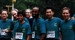
(l. to r.) Alan Turner, Fritz
Muller, Jud Santos, (passerby in back), Fasil Yilma, Casey
Yamazaki, Peter Allen
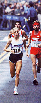
THE RED UNIFORM
The November 1999 issue of Runners
World has an article on page 52 by Peter Gambaccini about
historical moments in the New York City Marathon. There is
a photo of Grete
Waitz leading in the 1984 marathon. As was usually the
case, she was followed closely by our Fred Kolthay.
Please note that Fred's Central Park Track Club uniform is
red in color! Eeeek!
THE GREEN UNIFORM
At the Boston Marathon, 42 year-old
Fritz Mueller was 38th place overall with a time 2:20:47
which set the master course record that held for next 6 years.
Please note that Fritz's Central Park Track Club
uniform is green and white!
|

